


Infographics save lives – graphic design and data visualisation
Thoughts on design - Simon

Infographics save lives – graphic design and data visualisation
Thoughts on design - Simon
18th May 2020
A public health crisis
In the middle of the current Covid-19 pandemic, it is worth remembering how infographics save lives during health crises. When cholera ravaged London in 1854, the physician John Snow mapped out incidences of the disease, and noticed a large cluster around the water pump on Broad Street. Snow’s map helped nudge forward a crucial idea: that diseases could be caused by contact with an as-yet-unknown contagion – bacteria. Snow curtailed the outbreak of Cholera by removing the handle of the water pump and the epidemic subsided. His findings inspired the adoption of anaesthesia as well as fundamental changes in the water and waste systems of London, which led to similar changes in other cities, and a significant improvement in general public health around the world. Effectively his early example of an infographic helped to save lives. There was no need for a fancy contact-tracing App!
The history of visualising data
A map is essentially a visual representation of geographic information, and maps can be considered as the original ‘infographics’. They have existed for around 8,000 years. The Vinland map is a 15th-century mappa mundi example and the landmasses are surprisingly accurate.
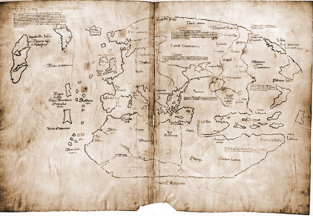
Vinland Map, 15th-century
For many centuries, it was rare to graph anything other than geography. Only a few historical examples exist. In 1765, the British polymath Joseph Priestley produced a ‘Chart of Biography’, plotting the lives of about 2,000 historical figures on a timeline. A picture, he argued, conveyed the information “with more exactness, and in much less time, than by reading.”
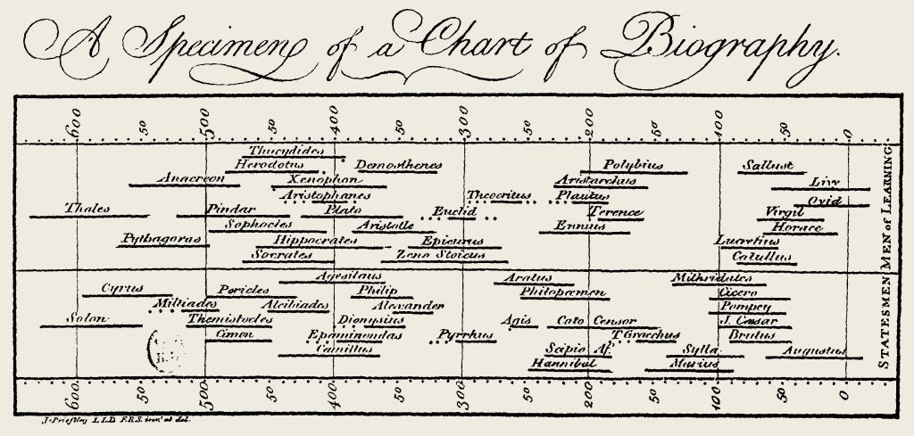
Joseph Priestley's ‘Chart of Biography’, 1765
The visual power of infographics
The old adage that a picture is worth a thousand words is particularly important in an age of mass communication, and short attention spans. Well-designed information graphics can convey meaning far more effectively than a mere verbal description.
- 10% of people remember what they hear
- 20% of people remember what they read
- 80% of people remember what they see and do
The human brain processes images 60,000 times faster than text, and 90 percent of information transmitted to the brain is visual. Essentially we respond to and process visual data better than written or spoken words.

Visual_power_of_infographics
Pie chart, bar chart or pictogram?
It’s vital that the correct choice of infographic is made. I don’t remember many maths lessons from school, but I do recall being taught when it was best to use a pie chart, a bar graph, or a line tool, and graphic designers should remember some basic rules.
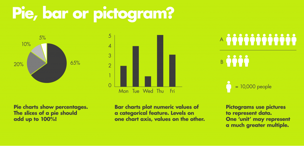
How to choose what type of graph to use
When to use a pie chart
Pie charts are generally used to show percentages or proportional data. The slices of a pie should add up to 100%! Pie charts are good for displaying data for between 2 and 10 categories. When there are more categories it is difficult for the eye to distinguish between the relative sizes of the different sectors and the chart becomes difficult to interpret. It is usual for the different sectors of the pie chart to be arranged clockwise in order of magnitude. The percentage represented by each category can be provided next to the corresponding slice of pie. Don’t be tempted by 3D effects and exploding pie charts. These may look snazzy, but they make it hard to compare different categories and detract from the message you are trying to convey.
Bar charts – simple to create, easy to interpret
Bar charts are used to display and compare the number, frequency or other measure (e.g. mean) for different discrete categories of data. There are several variations of the standard bar chart including horizontal bar charts, grouped or component charts, and stacked bar charts.
Pictograms to add visual interest
A pictogram is one of the simplest (and most popular) forms of data visualization. Pictograms use a series of repeated icons to visualize simple data. They are often used to make simple data more visually interesting, more memorable, or more engaging.
Other types of infographic
Line charts
Line charts are often used to visualise a trend in data over intervals of time. The line is often drawn chronologically. We designed the chart below as part of an annual review for Latymer Upper School in Hammersmith. The infographic combines a line chart, with simple pictograms to communicate 2 key facts - the rise in the cumulative total of funds raised and the increase in the number of bursary pupils. Good graphic designers understand when to use a line chart, or when a bar chart is more appropriate. Mercer design are well-known for their knowledge of information graphic design. We understand how to convey information visually and how to draw out key messages.

An example of a line chart from the Laytmer Upper School Review
Scatter plot
This is an example of a scatter plot we created for CTA's ground-breaking report, The Digitalisation of African Agriculture. It plots 2 variables, in this case, strength of mobile internet and The World Bank’s Enabling the Business of Agriculture (EBA) score. Countries are then grouped together by colour to make the graph easier to understand. The report looks at how digitalisation is affecting African agriculture and enabling farmers to meet the growing demands for food. The 240-page report, designed by Mercer Design, uses infographics throughout to highlight key points. The report is a game-changer in boosting productivity, profitability and resilience to climate change and is a good example of how infographics save lives.

Example of a scatter graph from CTA's Dalberg Report
Spider charts
A spider or radar chart is a graphical method of displaying data with more than one outcome variable in the form of a two-dimensional chart of three or more quantitative variables represented on axes starting from the same point. Confused? Exactly. Which is part of the problem of radar charts. The average person has to work very hard to understand what they are communicating, which goes against the very purpose of an infographic. They work best when the results are quite different and a star pattern emerges. People can then see the relative importance of the different variables. When results are very similar, a spider chart becomes hard to interpret.

Spider or radar diagrams can often prove hard to understand
Infographics save lives
At the time of the Covid-19 crisis, there is a torrent of information graphics, some good, some bad. It shows that there is a quest for knowledge, and that people want facts to be displayed visually. Online information graphics mean that diagrams can be interactive and dynamic, but can infographics save lives?
I'm sure John Snow would argue that his infographic from 1854 helped to save people from the ravages of cholera, but it took a long time. He originally published his findings in August of 1849. Snow was convinced that cholera was being spread through contaminated water. At his own expense he published a pamphlet entitled On the Mode of Communication of Cholera. In the mid 19th-century, most physicians believed that cholera was caused by 'miasmas' (poisonous gases that were thought to arise from sewers, swamps, garbage pits and open graves). The medical profession rejected his findings with the damming conclusion that Dr. Snow could 'furnish no proof whatever of the correctness of his views.' It wasn't until 1866 that William Farr, one of Snow's chief opponents, realised the validity of his diagnosis when investigating another outbreak of cholera at Bromley by Bow and issued immediate orders that unboiled water was not to be drunk.
John Snow's findings and his mapping of cholera changed accepted medical thought and led to significant improvements in general public health around the world. However, it took 17 years for the medical profession to listen to John Snow. Perhaps with more compelling infographics, and a splash of colour (?!) other medics might have been persuaded at an earlier date. One thing for sure, infographics will be with us for centuries to come and the role of intelligent graphic design is more important than ever.
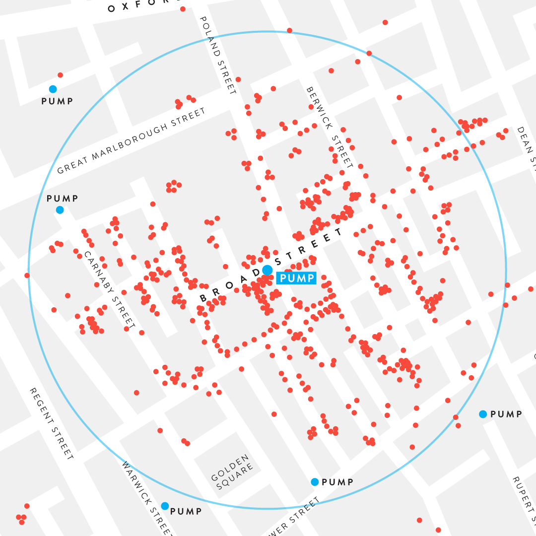
John Snow cholera map, 2020 version
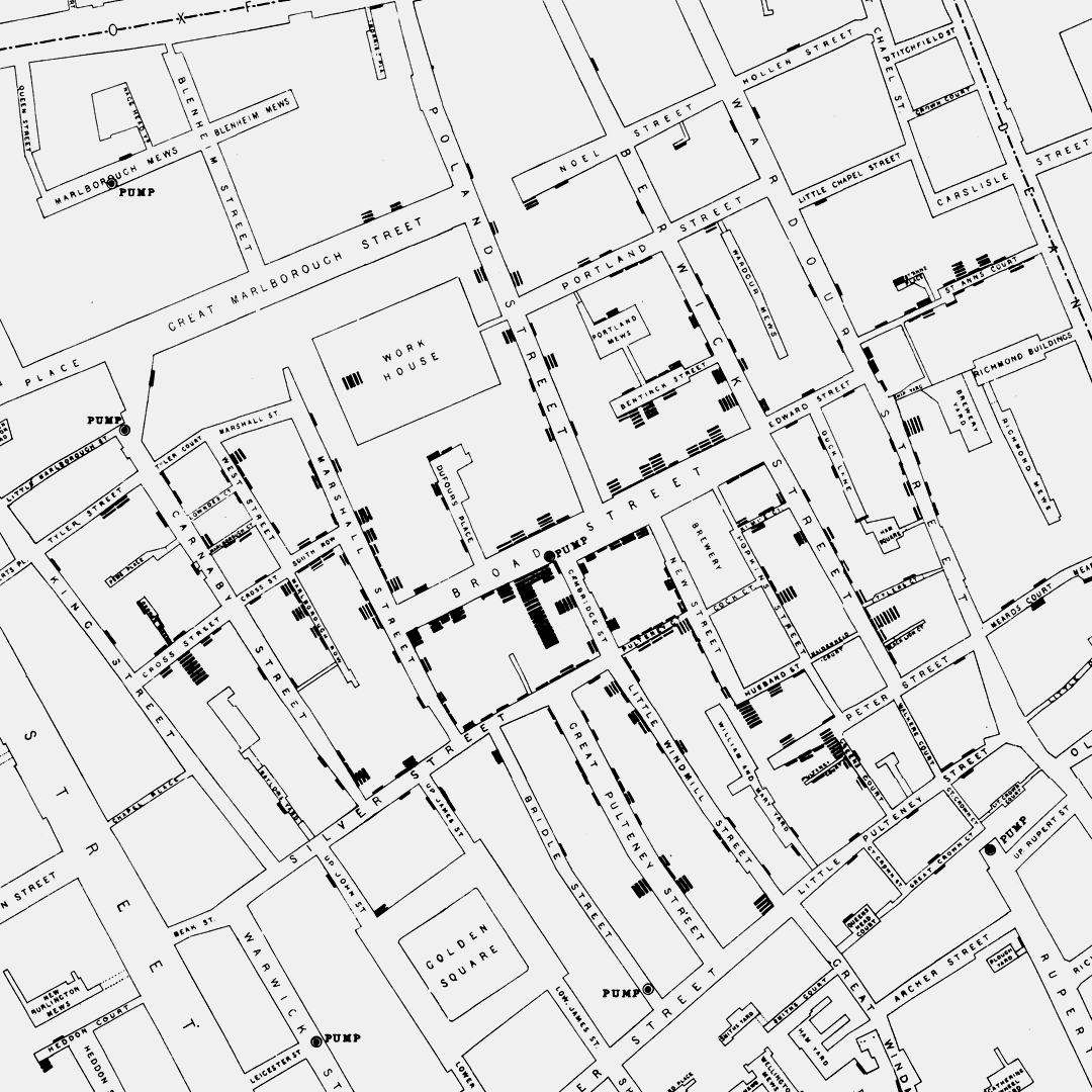
John Snow's original map of 1854