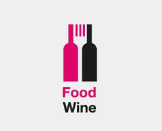
Some of the best logo designs are exquisitely simple, squeezing meaning out of every possible line, gesture, mark and even empty space. As graphic designers, we call this use of blank space negative space, and we're constantly striving for balance between the positive marks on the page and negative space which make up a logo. Here are some examples of our favourite uses of negative space in logo design.

food-writers-guild-logo-negative-space
zip-logo-negative-space
up-logo-negative-space
british-steel-logo-negative-space
food-and-wine-logo-negative-space
fido-logo-negative-space
city-key-logo-concept-negative-space
killed-productions-negative-space

But it's not just for use in logos - there are some great examples of negative space being used in advertising. We love these posters designed for Fiat to help raise awareness of the dangers of texting and driving. 

Fiat-Anti-Texting-and-Driving-campaign-advert-negative-space
Fiat-anti-texting-and-driving-campaign-advert
But the use of negative space isn't restricted to logos and clever adverts – once you know it's there, you'll start seeing it in everything! We love how these film posters use negative space to convey particular aspects of the film's stories.
coffee-and-cigarettes-negative-space-poster
amerian-warewolf-in-london-negative-space-film-poster
nebraska-negative-space-film-poster
But no blog post about negative space would be complete without the king of all negative space logo designs: Fed Ex. Once you see the arrow, you just can't help but love it's simple conceptual brilliance.
fed-ex-logo-negative-space